
Whenever any business/client decides to have a website, they run for a Website Development Company. This is the time when a physical presence is not as much popular as a virtual presence. There are many examples of those who don’t even have a physical presence in the market, but their virtual presence is strong enough to raise the benefits.
Now, let’s understand the responsive web design process. When a business approaches a Website Design Company in the USA or any other country, the client projects his desire and requirements for a website and sees that on a computer screen. But making the same website responsive is equally essential, as people as the world has become a global village. When a person needs to explore something, they most likely use their mobile as a computer system can’t be carried about.
Any significant or Small Business Web Design Service only various techniques to make the website much responsive so that it can easily explore anywhere, whether it is opened on a computer system or on any mobile phone. Responsive Website Design and Development Services acquires some specific technique to indulge customer’s need to have a fully-fledged website to be correctly displayed.
Below we are going to learn about Most Responsive Web Design Tips In 2020
Table of Content
- Plan the design first
- Optimize Images
- Perform Navigation carefully
- Include Trigger for Keyboards
- Consider the mobile screen first
- Ensure Button clicks for Smaller Screens
- Use Micro-interaction
- Optimize Typography
- Check that Share Buttons are not Blocking Content
- Stick to Minimalist Design
- Adopt Frameworks
- Conclusion
Table of Contents
Plan the design first
This is the most crucial tip to attain a perfect responsive web page. Many designers start from wireframe and then visual design and coding. It would help if you planned a layout first and then only go for the design. Then customize the templates and integrate the codes efficiently. You must create many prototypes of the same webpage and keep checking them all on various screens to make sure you have achieved success.
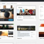
Optimize Images:
An image has a capacity of many words, and this should not be neglected while responsive webpage designing. If a user visits the page, the pictures on the page help them to create an emotional connection. Hence, according to Kenneth Sytian of Sytian Web Design Philippines, it is crucial that you optimize your images for both mobile and desktop users.
You must save every image in a proper format. You can choose to keep the images in PNG and JPG format.
Perform Navigation carefully:
The Navigation is somehow a roadmap for the visitors of a website. They direct them to visit multiple pages on a particular site. Therefore, proper care for making a responsive webpage is essential in this case. Here the web designer can reduce the worry while making a hamburger icon for mobile devices and hide the menu tabs in it. This is somehow a great tip to reduce the navigation settlement worry for responsive web designing.
Also, you can read Top 10+ Web Design Magazines for Designers
Include Trigger for Keyboards:
The forms on the webpage need to look perfect. In this reference, the mandatory input fields should include a textual keyboard. Although you may choose to enter any key, they usually request for a number that is likely to trigger the number keyboard immediately. This improves the responsiveness of the website.
Consider the mobile screen first:
If you are attempting to design a responsive webpage, you must think about the mobile screen first. Once you have managed the codes and image for the mobile screens and it works properly, you can move ahead to more substantial screens.
Ensure Button clicks for Smaller Screens:
You need to pay great attention to the buttons of the webpage. Buttons are easily viewed on a large screen, but they create frustration. Make sure that they can be clicked easily. Here you can play with multiple colors and shapes.
See More:- Canva: Best Graphic Design Website Tool
Use Micro-interactions:
Micro-interactions are gaining attention these days. Therefore, you must use them for responsive design. They provide users with information, which is very useful on internet-enabled phones, instead of starting over.
Optimize Typography:
It would help if you made sure the text is legible for the small screen. A preferable size for a body part is or 1em or 16px, and you should adjust the headings according to that. On the other hand, you should also choose legible fonts and try to avoid decorative or script fonts.
Check that Share Buttons are not Blocking Content:
The share button is something that helps you to explore your business’ area. Therefore, you must remember to place the scaly Share Button. Sometimes the buttons are placed so inappropriately so that they hid the Content. It would help if you disabled these for screens, which are less than 768 px.
Stick to Minimalist Design:
Minimalist Design is getting popular these days. Here, the visitor can focus on your websites’ Content. This further increases the conversion rates for the business. It helps visitors neglect the other unnecessary clutter as this design eliminates the clutters to keep visitor-focused.
Adopt Frameworks:
If you are using a responsive framework for your website designing, then you can reduce lots of time, which could be wasted while struggling for responsive webpage design. Bootstrap is an unbeatable HTML framework that lets you work with a responsive framework for your workflow. You can use it for the static webpage.
On the other hand, if you are going to design more complex website themes, is excellent for embracing responsive webpage development.
Conclusion:
Whenever a Responsive Web Design Company starts development for such a website, they imply several techniques to serve the clients with the best efforts. The web design trend of the year 2019 is changing its way of seeing the world, and the development is increasing every day. Responsive website designing is equally important, and the focus on this area is expanding.
Once you are done with your designs, you should check it many times and on different screens. Screens have different resolutions. Therefore, you must keep changing and enhancing your work to deliver the final product to the customer.
Here are a few more topics that you shouldn’t miss:
CSS Hero Review- Design Customization Made Easy
Like this post? Don’t forget to share