Graphic design is something that keeps your users engaged with your product more effectively. It allows you to communicate visually with the clever use of fonts, colors, and many more design elements. Visual representations are always the most successful way to grab the attention of the people. The human mind can remember visuals longer than written text. That’s why companies are investing a lot of money in graphic design for various purposes like logo design, web design, and much more.
Specifically, when it comes to marketing the brand, a Freelance Graphic Designer has a significant role in it. Designs always have the most attractive and memorable elements, which drive more user traffic towards your brand. However, when it comes to graphic design, the rules or principles must be followed to create an effective and alluring design. Every designer has a different set of minds, but the rules must be followed very carefully.
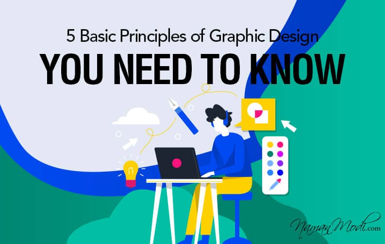
Some Graphic Design Principles that you must know:-
1. Balance
One of the basic graphic design principles which every designer needs to follow while designing graphics. Every element you use has some weight, and that must be used properly. It can be from color, font, and a lot more.
As we can not put everything in one place, the same way, all the designs can not be used in one corner. You should not gather all the heavy elements in the same place because, without proper balance, the design designer won’t like to see it. Even in the custom logo design, designers need to follow this concept or just make simple designs that reduce this chance. To maintain the balance in the design, it’s a good choice to make it symmetric. Therefore, make sure you follow this important principle while designing graphics or business logo design.
2. Hierarchy
This would be applicable when you want to combine more than one element in the design. When you want to prioritize any of the design sections, make sure you maintain the hierarchy. It lets the brand to focus on the priority elements of the design if maintained properly. It includes highlighting the titles, important messages, focus on images, symbols, and much more.
Hierarchy creates visual organization in the design so that viewers can identify from where to start looking. You can arrange like; heading, subheading, body text. This is a simple example of the hierarchy. Thus, this is how you need to maintain the hierarchy in the design.
3. Contrast
Another very important key principle designers need to understand while designing. Contrast designs hold the personality of the design very effectively.
When there are two elements opposite, big and small, modern and classic, then the contrast plays a huge role. The human eye likes to watch the contrast, so try to make it appealing. In contrast, the fonts’ selection has a great impact, so make sure you choose the right colors. For instance, there are two buttons on the website, one is auto-selected, and the other is not. Then the auto-selected must be brighter, and the other must be lighter. So, follow this principle while designing graphics.
4. Color and white space
Colors are always important when it comes to designing something. The same way in the graphics also has great significance. The selection of the right color takes your design to the next level and defines its tone.
There is a wide range of colors available that you can use, but it must be according to the design. You can use single or multiple colors in the design, but make sure that it looks appealing together.
Moreover, the white space in it makes your design even more legible. The white space lets you evoke some meaningful message to the viewers if it’s designed very carefully. Resultantly, it improves your logo and takes it to the next level. Hence, this is how you can design it appealingly using colors and the utilization of white space.
5. Repetition
Repetition strengthens the overall design, and it’s a fundamental design element. It let you create rhythm in the design, whether it’s web design, poster, business logo design.
It’s better to create something creative and don’t copy designs. We have seen many business copies of each other’s flyers posters, brochures, and other print idea designs. We suggest rather than coping you should design a flyer, posters in your own creative way, that is innovative and unique in the industry.
Repetition is much more important when it comes to multipage designs such as books, magazines, websites. It shows uniformity on every page and gives a better visual experience. Even in designing some patterns, this would be the most applicable concept.
Conclusion
It’s really important to follow some principles while designing, and it lets you get outstanding result. The same things are applicable in the graphics. Also, the above-mentioned points let you understand the basic graphic design principles. It’s highly recommendable to follow it carefully to get the perfect design result, which lets you attract the audience. If you want to know more about graphic designer, Contact me by fill out online form to Book an appointment today.
